Figma
SharePoint
2025
Building an EV Adapter Hub That Guides Users Off-Site
Duration
3 months
My Role
Associate UX Designer
Team
UX Director, Senior Copywriter
Project Overview
This project was part of an 18-month engagement I had with an EV charging products company. About four and a half months into onboarding, I was tasked with leading design on a new adapter product experience while simultaneously supporting three other projects for the same client as a secondary designer. Balancing that workload required sharp prioritization throughout.
My Role
I led design on three interconnected pages while also supporting three other client projects as a secondary designer. I owned the end-to-end visual design from high-fidelity explorations through final handoff, facilitated working sessions with the client to align on direction in real time, and collaborated closely with the UX Director and Senior Copywriter throughout.
The project resulted in three distinct pages, each serving a different role in the user journey:
Adapters Overview
Showcased all available charging packages and adapters with links to third-party retailer sites.
Landing Page
Introduced adapter technology, a map overview, retailer purchase links, and how-to videos.
Ecosystem Page
Compared charger types, charging speeds, app downloads, and EV weather performance using a tabbed component.

Research and Process
Discovery began with two key reference points. First, an earlier version of the adapter page that had been designed for the client but never launched. Rather than starting from scratch, I used it as a structural foundation while identifying what needed updating to reflect current direction and brand standards.
Second, the client's own live site, which already covered related content. I reviewed how the page was organized and presented information, which helped me shape the page architecture for the new experience. It also gave the copywriter a reference point for tone and content direction early in the process.
One feature on the client's live site was an interactive map showing EV charging stations across the United States. Its role in the new design shifted several times throughout the project, which is covered in more detail in the design process section.

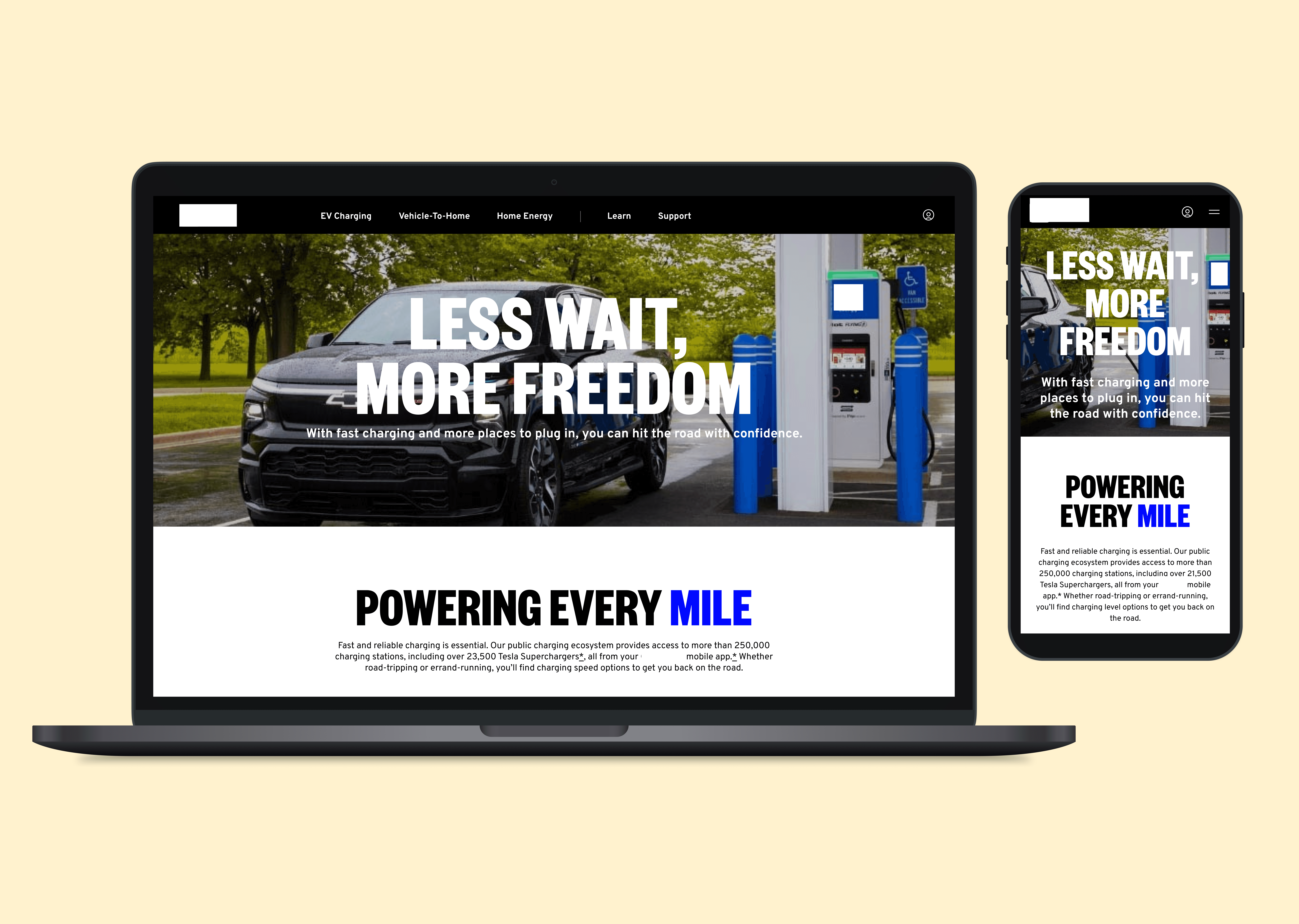
Live page


Previous unlaunched update
The Challenge
Adapters couldn't be purchased directly on the client's site. This was a business constraint that meant the page couldn't function as a standard e-commerce experience. Research showed users expected a direct path to purchase, so the design needed to educate and build enough confidence to guide them off-site to a third-party retailer without losing them along the way.
The Solution
The pages were designed as a hybrid content hub: part product education, part navigation tool. Structured sections informed users about adapter types and compatibility, while clear and prominent links guided them to the right third-party sites to buy.
Design Process
The process moved quickly and stayed collaborative throughout.
Initial Design
Working high-fidelity from the start, I developed multiple explorations per section simultaneously, keeping alternates staged and ready to surface during client calls.
Client Iterations
Feedback was incorporated across several rounds of live client reviews, including refining icon styling to resolve a false affordance and adapting scope around the interactive map, which was ultimately flagged as a future enhancement.
Final Handoff
Completed files were delivered to the development team via SharePoint, with the final designs reflecting the hybrid education and navigation structure the pages required.
A few decisions from that process stand out:
The interactive map
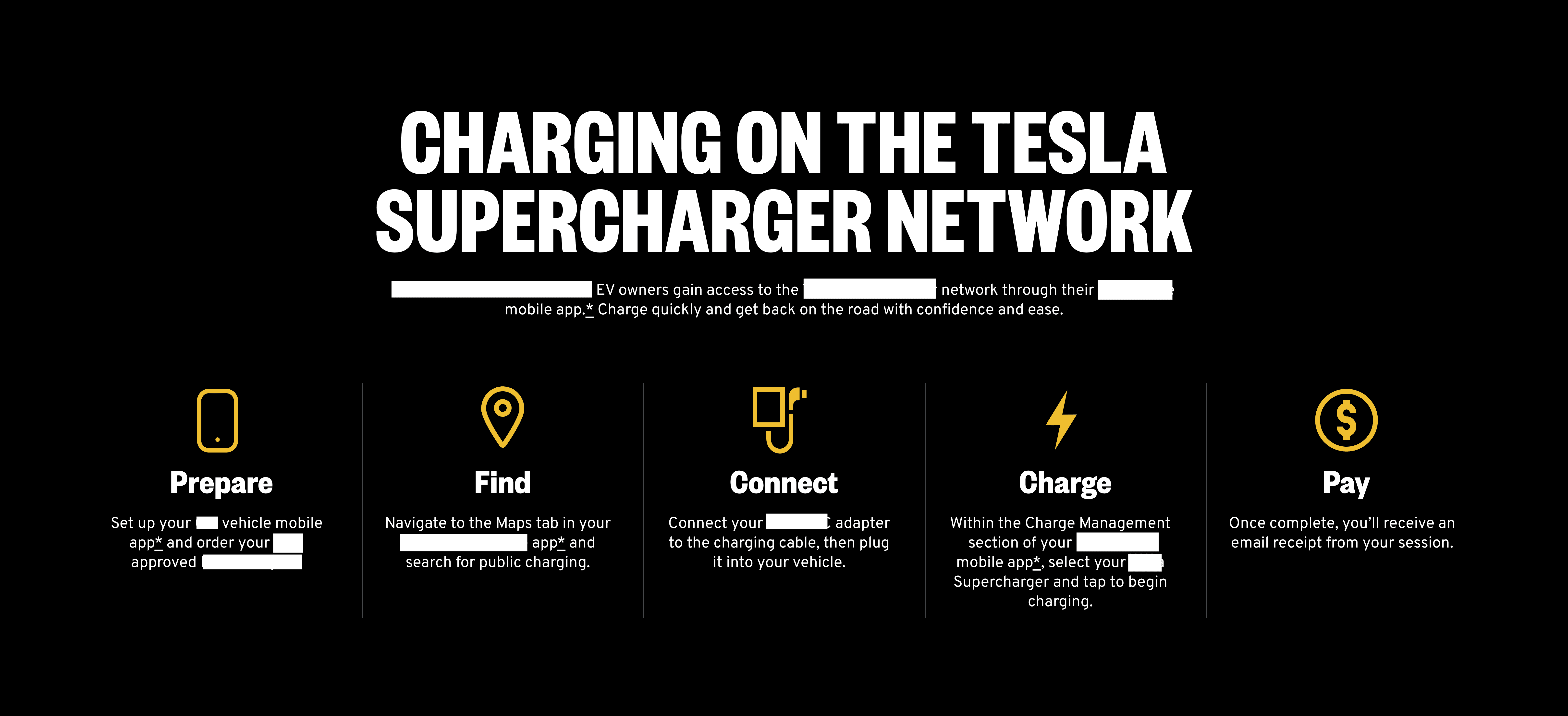
The interactive charging station map moved from a live feature in early designs, to a static screenshot for MVP (minimum viable product), to being cut from scope entirely and flagged as a future enhancement as the aesthetic direction evolved. Post-launch, I contributed to redesigning the map itself to align with the new design standards, updating the typography, icon style, and color system.
Icon color and visual hierarchy
Section icons were styled in yellow, which was the same color used for interactive elements in the secondary navigation higher on the page. This created a false affordance, making decorative icons appear clickable. Switching the section icons to light blue created a clear distinction between interactive UI elements (yellow) and informational icons (blue), preserving the integrity of the color language across the page.
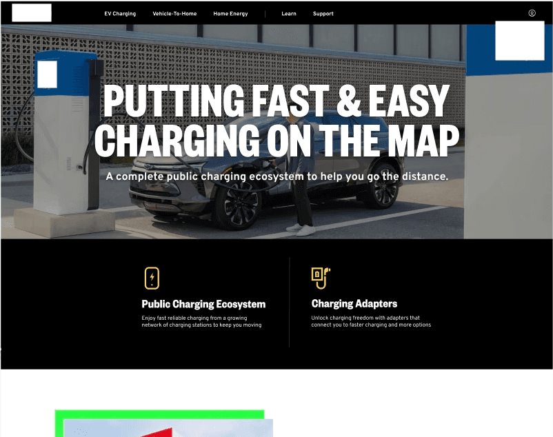

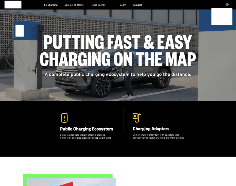
Previous yellow icons that matched clickable elements
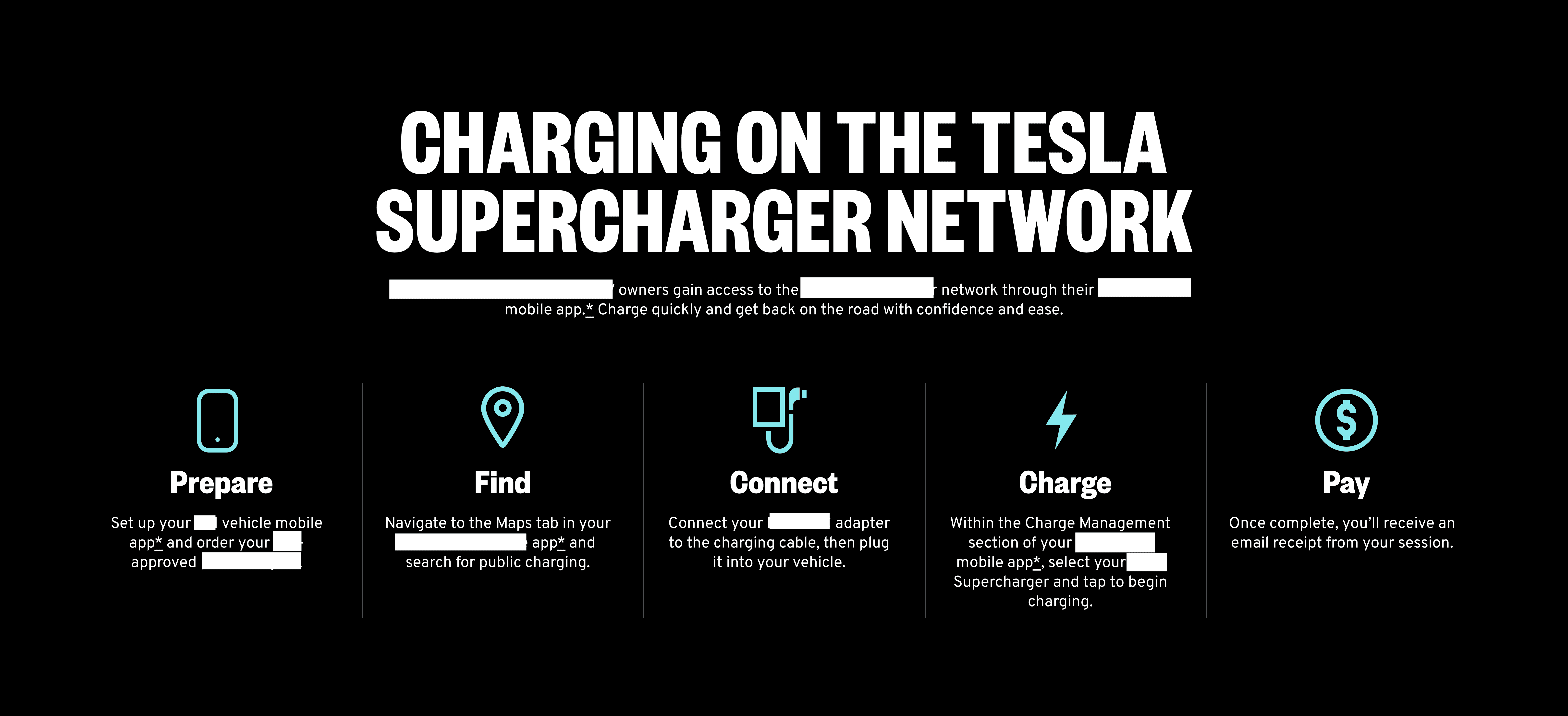
Updated blue icons
Ecosystem Page
The ecosystem page needed to help users compare charger types, including a newly upgraded model being rolled out nationally. Key design decisions I contributed towards included:
A graph-style comparison component to make charger differences scannable and easy to contrast at a glance.
A dedicated section to distinguish charging speeds clearly.
A tabbed component to organize information about how EVs handle different weather conditions with proper charging and care.
App download links and an embedded video on how to locate a charging station.


Reflection
This project sharpened my ability to stay adaptable under pressure, lead with clarity across competing workstreams, and turn client collaboration into a design advantage.
Key Takeaways
💡
Scope changes are inevitable. Learning to stay flexible while holding the design direction together taught me how to protect the integrity of a project without being rigid about the path to get there.
💡
Designing around a business constraint pushed me to think beyond layout and focus on how design builds trust. Knowing users couldn't buy directly on-site reshaped how I approach any experience where the user's expected path and the business reality don't align.